
Visualizing Network Optimization Model Results Using Python
A quick way to validate network optimization model results is visually creating optimal flows map which shows flows between source and destination. This post explains how to create such visualizations using Python.
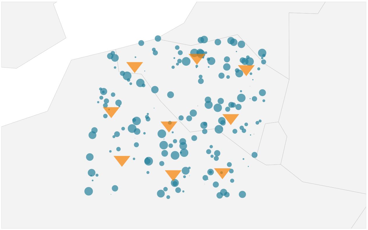
The Greenfield Algorithm uses customer locations with annual demand as an input and calculates allocation of distribution centers to customers. Distribution center and customer locations, and optimal flows maps can be used to visualize model inputs and outputs. Figures 1 and 2 show these maps.
 |
|---|
| Figure 1: Locations map |
 |
|---|
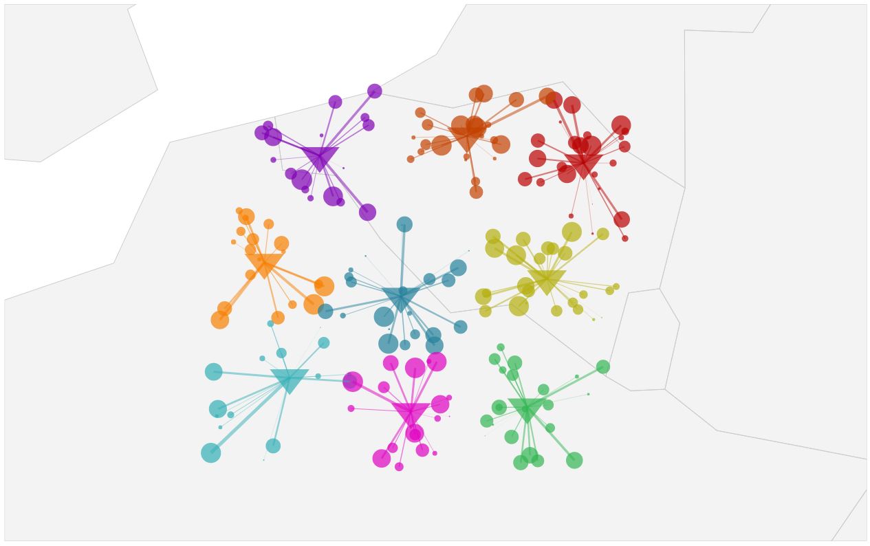
| Figure 2: Optimal flows map |
Python can be used to create location and optimal flows maps quickly. This helps modelers to validate model inputs and results.
Application
We use results from the Greenfield analysis to build
- Locations map: Consists of distribution center and customer locations.
- Optimal flows map: Consists of distribution center, customer locations, and flows between those points.
In the Python code, we first initiate libraries and define colors and shapes lists. Then, we read the results data.
import pandas as pd
import plotly
import plotly.graph_objs as go
plotly.offline.init_notebook_mode()

colors = ['rgb(0, 128, 155)', 'rgb(255, 128, 0)', 'rgb(191, 2, 2)', 'rgb(0, 175, 181)', 'rgb(0, 181, 78)', 'rgb(181, 175, 0)', 'rgb(130, 0, 181)', 'rgb(230, 0, 195)', 'rgb(201, 67, 0)']
shapes = ['circle', 'triangle-down', 'square', 'diamond', 'square', 'cross']

algorithm_results = pd.read_csv(r'https://raw.githubusercontent.com/emrahcimren/Greenfield_Bluefield_With_Weighted_Kmeans/v1.1/data/results/customers_with_clusters.csv')
algorithm_results = algorithm_results[(algorithm_results['NUMBER_OF_CLUSTERS']==9) & (algorithm_results['ITERATION']==10)]
filter_paths = (algorithm_results['CLUSTER'] == 3) & (algorithm_results['CUSTOMER_NAME'] == 'Customer 87')
algorithm_results = algorithm_results[~filter_paths]
Locations Map
Locations map consists of base map and distribution center and customer locations. We create location points as follows in Python.
point_locations_customers = algorithm_results[['CUSTOMER_NAME', 'LATITUDE', 'LONGITUDE', 'DEMAND']].drop_duplicates().rename(columns={'CUSTOMER_NAME': 'LOCATION_NAME', 'DEMAND': 'LOCATION_WEIGHT'})
point_locations_customers['LOCATION_TYPE'] = 'CUSTOMER'
point_locations_customers['LOCATION_WEIGHT_FACTOR'] = 30
point_locations_customers['ADJUST_MARKER_SIZE'] = True
point_locations_warehouses = algorithm_results.groupby(['CLUSTER', 'CLUSTER_LATITUDE', 'CLUSTER_LONGITUDE'], as_index=False).agg({'DEMAND': sum}).rename(columns={'CLUSTER': 'LOCATION_NAME', 'CLUSTER_LATITUDE': 'LATITUDE', 'CLUSTER_LONGITUDE': 'LONGITUDE', 'DEMAND': 'LOCATION_WEIGHT'})
point_locations_warehouses['LOCATION_TYPE'] = 'DISTRIBUTION CENTER'
point_locations_warehouses['LOCATION_WEIGHT_FACTOR'] = 50
point_locations_warehouses['ADJUST_MARKER_SIZE'] = False
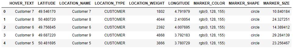
point_locations = point_locations_customers.append(point_locations_warehouses)Figure 3 shows point locations data.
 |
|---|
| Figure 3: Point locations data from Python |
The following function adds marker size, color, and shape to each location point.
def add_shapes_and_colors_to_locations_for_visualization(locations, colors, shapes):
    '''
    Function to add marker sizes, colors, and shapes to locations
    :param locations:
    :param colors: List of colors
    :param shapes: List of shapes
    :return: Updated locations
    '''

    location_types = locations['LOCATION_TYPE'].unique()

    locations_list = []
    for idx_loc, location_type in enumerate(location_types):

        by_location_type = locations[locations['LOCATION_TYPE'] == location_type]
        maximum_weight_factor = by_location_type['LOCATION_WEIGHT_FACTOR'].mean() / by_location_type[
            'LOCATION_WEIGHT'].max()

        for _, location in by_location_type.iterrows():

            if location['ADJUST_MARKER_SIZE']:
                marker_size = location['LOCATION_WEIGHT'] * maximum_weight_factor
            else:
                marker_size = location['LOCATION_WEIGHT_FACTOR']

            locations_list.append({
                'LOCATION_NAME': location['LOCATION_NAME'],
                'LOCATION_TYPE': location['LOCATION_TYPE'],
                'HOVER_TEXT': location['LOCATION_NAME'],
                'LATITUDE': location['LATITUDE'],
                'LONGITUDE': location['LONGITUDE'],
                'LOCATION_WEIGHT': location['LOCATION_WEIGHT'],
                'MARKER_SIZE': marker_size,
                'MARKER_COLOR': colors[idx_loc],
                'MARKER_SHAPE': shapes[idx_loc]
            })

    return pd.DataFrame.from_records(locations_list)
point_locations = add_shapes_and_colors_to_locations_for_visualization(point_locations, colors, shapes)We use the following visualization function to create maps from location points. In the function, we define point locations using latitude and longitudes and map layout. Resulting location map is saved to an .hmtl file. Figure 4 shows the location map output.
def visualize_points_and_flows(point_locations, paths, map_title, scope, output_html_file):
    '''
    Function to visualize points and flows
    :param point_locations: Point to be visualized with latitude and longitude
    :param paths: From to flows
    :param map_title: Title
    :param scope: Region name; europe, north america
    :param output_html_file: name of the output file
    :return:
    '''

    locations = [dict(
        type='scattergeo',
        locationmode='country names',
        lon=point_locations['LONGITUDE'],
        lat=point_locations['LATITUDE'],
        hoverinfo='text',
        text=point_locations['HOVER_TEXT'],
        mode='markers',
        marker=dict(
            size=point_locations['MARKER_SIZE'],
            color=point_locations['MARKER_COLOR'],
            symbol=point_locations['MARKER_SHAPE'],
            line=dict(
                width=5,
                color='rgba(68, 68, 68, 0)'
            ),
        ))]

    layout = dict(
        title=map_title,
        titlefont=dict(size=30),
        showlegend=False,
        autosize=True,
        hovermode='closest',
        geo=dict(
            scope=scope,
            showframe=False,
            projection=go.layout.geo.Projection(type='azimuthal equal area', scale=15),
            center={'lat': point_locations['LATITUDE'].mean(), 'lon': point_locations['LONGITUDE'].mean()},
            showland=True,
            landcolor='rgb(243, 243, 243)',
            countrycolor='rgb(204, 204, 204)',
            showcountries=True
        ),

    )

    if paths is None:
        return plotly.offline.plot({"data": locations, "layout": layout}, filename='{}.html'.format(output_html_file))
    else:
        return plotly.offline.plot({"data": locations + paths, "layout": layout},
filename='{}.html'.format(output_html_file))visualize_points_and_flows(point_locations, None, 'Distribution Center and Customer Locations with Demand', 'europe', 'point_visualization')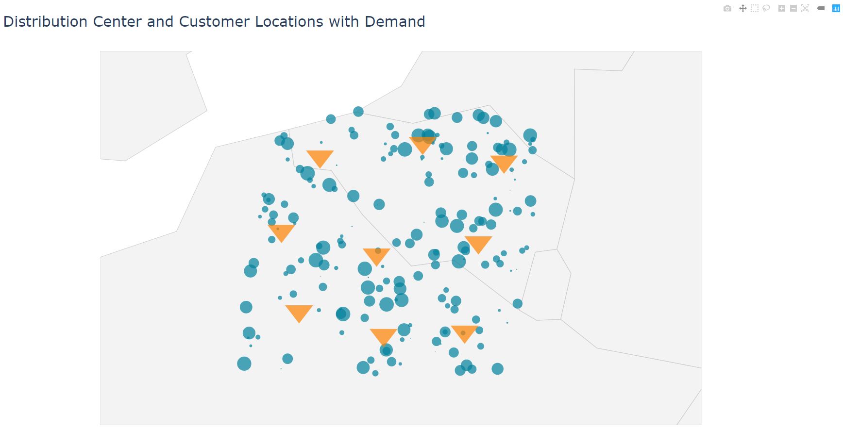 |
|---|
| Figure 4: Location map |
Optimal Flows Map
We visualize source-destination flows using the optimal flows map. Source-destination flows is created from the Greenfield analysis results as in Figure 5.
flows = algorithm_results[['CLUSTER', 'CLUSTER_LATITUDE', 'CLUSTER_LONGITUDE', 'CUSTOMER_NAME', 'LATITUDE', 'LONGITUDE', 'WEIGHTED_DISTANCE']].rename(columns={'CUSTOMER_NAME': 'DESTINATION_NAME', 'LATITUDE': 'DESTINATION_LATITUDE', 'LONGITUDE': 'DESTINATION_LONGITUDE', 'CLUSTER': 'SOURCE_NAME', 'CLUSTER_LATITUDE': 'SOURCE_LATITUDE', 'CLUSTER_LONGITUDE': 'SOURCE_LONGITUDE', 'WEIGHTED_DISTANCE': 'PATH_WEIGHT'})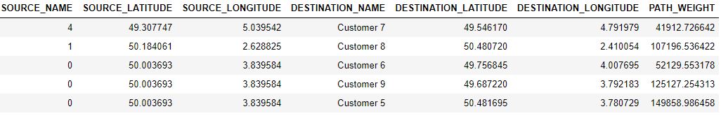 |
|---|
| Figure 5: Flows data |
Marker colors in the location data is updated using the following function.
def update_locations_colors_for_flow_visualization(flows, locations, colors):
    '''
    Function to update colors for the flow map
    :param flows: From to locations
    :param locations: Point locations
    :param colors: Plot colors
    :return: Update locations and mapped colors to sources
    '''

    color_base_column = 'LOCATION_TYPE'
    color_base_value = 'DISTRIBUTION CENTER'

    color_bases = locations[locations[color_base_column] == color_base_value]
    color_bases = color_bases.sort_values(['LOCATION_NAME'])
    color_bases = pd.DataFrame(
        {'SOURCE_NAME': color_bases['LOCATION_NAME'], 'MARKER_COLOR': colors[:len(color_bases['LOCATION_NAME'])]})

    for _, color_base in color_bases.iterrows():
        by_flow = flows[flows['SOURCE_NAME'] == color_base['SOURCE_NAME']]
        by_flow_list = by_flow['DESTINATION_NAME'].tolist() + [color_base['SOURCE_NAME']]
        filter_paths = locations['LOCATION_NAME'].isin(by_flow_list)
        locations.loc[filter_paths, 'MARKER_COLOR'] = color_base['MARKER_COLOR']

return pd.DataFrame.from_records(locations), color_basespoint_locations, color_bases = update_locations_colors_for_flow_visualization(flows, point_locations, colors)After updating marker colors in the location data, we also add marker colors to the flows data. Flows data is used generate path layer to the optimal flows map.
flows['SOURCE_NAME'] = flows['SOURCE_NAME'].astype(str)
color_bases['SOURCE_NAME'] = color_bases['SOURCE_NAME'].astype(str)
flows = flows.merge(color_bases, how='left', on=['SOURCE_NAME'])
flows['PATH_WEIGHT_FACTOR'] = 5
def create_paths(flows):
'''
Path layer to visualize source-destination flows on the map
:param flows:
:return: paths
'''
maximum_weight_factor = flows['PATH_WEIGHT_FACTOR'].mean() / flows['PATH_WEIGHT'].max()
paths = []
for _, from_to_flow in flows.iterrows():
paths.append(
dict(
type='scattergeo',
locationmode='country names',
text='from {} to {}'.format(from_to_flow['SOURCE_NAME'], from_to_flow['DESTINATION_NAME']),
lon=[from_to_flow['SOURCE_LONGITUDE'], from_to_flow['DESTINATION_LONGITUDE']],
lat=[from_to_flow['SOURCE_LATITUDE'], from_to_flow['DESTINATION_LATITUDE']],
mode='lines',
line=dict(
width=from_to_flow['PATH_WEIGHT'] * maximum_weight_factor,
color=from_to_flow['MARKER_COLOR'],
),
opacity=0.5,
)
)
return pathspaths = create_paths(flows)Finally, the following function creates the optimal flows map as in Figure 6.
visualize_points_and_flows(point_locations, paths, 'Optimal Flows', 'europe', 'flow_visualization')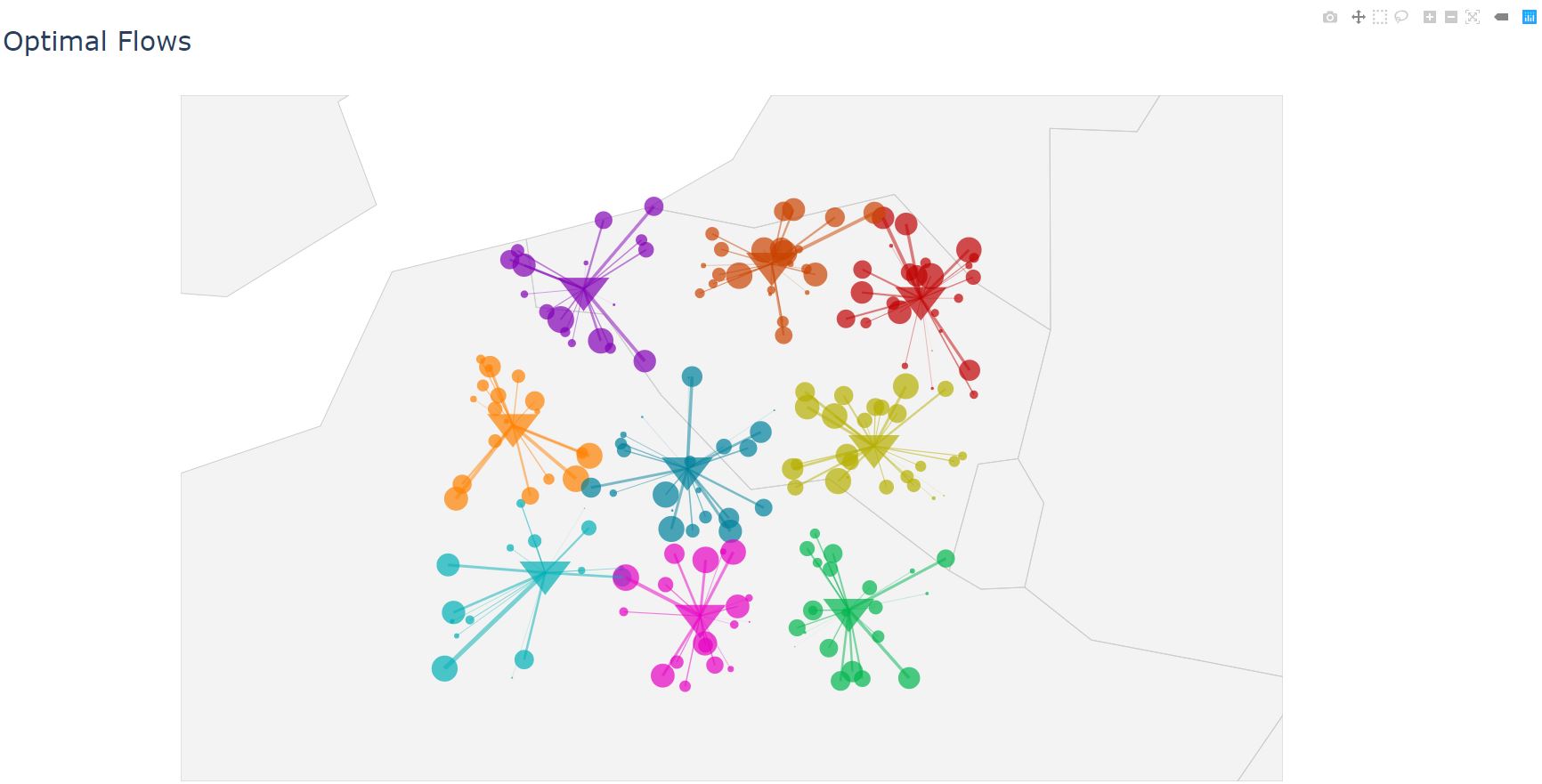 |
|---|
| Figure 6: Optimal flows map |